This post is also available in ITALIANO
Furnishing your home drawing inspiration from succulents. Have you ever considered it?
These days I’m working on a restyling project for a living area which needs sprucing up. After too many years of yellow and burgundy my clients contacted me because they wanted fresh but relaxing colours.
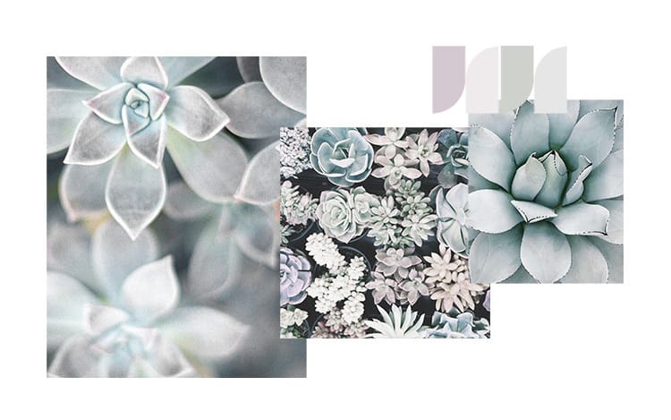
I’ve chosen a colour palette inspired by succulents, with pink, green and grey hues.

| styling unprogetto, ph. Davide Buscaglia |
Wilson&Morris | the emotional power of colour
Colour charts in hand, these are the four hues that I’ve chosen:
1039 | orchid white
1094 | foggy day
1077 | moss green
1075 | cloudy day

These are four colours by Wilson&Morris, an Italian company that creates interesting painting colours for interior design.
Among the available products by Wilson&Morris I’ve chosen Emulsion Matt, a water based paint with a matte look finish and velvety to the touch; of high quality, suitable for decorating walls and ceilings.
What I immediately fell in love with by Wilson&Morris is their colour chart: delicate but at the same time strong and original.
But now let’s go back to the moodboard I’ve created:

Orchid white and Cloudy Day create an ultra-light base but, unlike optical white, they can reduce the contrast effect with darker hues Foggy Day and Moss Green.
The final result is therefore extremely soft, ideal for an environment of nature and peace. I’m thinking about a slow-paced space, where colours get blurred over one another.
Inspiration | relax area and night area
Here are some examples of interiors inspired by this colour palette:

| bedroom via |

| reading corner via |

| relax corner via |

| reading corner via |
Whether for a bedroom or a reading area, this palette is perfect to relax, because it facilitates concentration and doesn’t cause eye fatigue thanks to the presence of a good amount of light grey in each of the four colours.
The final result is elegant and sophisticated, but decidedly original.
It’s the house of someone who loves taking care of themselves, who loves to stop and ponder, leaving the hectic life outside.
What do you think about this colour palette by Wilson&Morris?
I can tell you that I’m very pleased and I had a lot of fun creating this inspirational moodboard.
| If you like this inspirational approach and you want me to work on a project for you, have a look at my SERVICES |
| In the PORTFOLIO section you’ll find my works |
| If you want info about my projects you can send an email to unprogetto@gmail.com |
Leave A Comment