This post is also available in ITALIANO
These days I am looking for soft atmospheres, environments that envelop without suffocating, tactile and visually delicate sensations. I am looking for inspiration for a natural style house for a couple who are looking for a soft and delicate alcove in the house.
Their eyes need to rest from strong stimuli and overwhelming colors: and this is how I spend my hours selecting images with neutral colors, spaces with soft and almost mono-tone textures.
A house with neutral colors becomes the perfect background for a project to give the right charge and personality. Choosing to start from natural and earthy colors is a targeted choice that can lead to infinite solutions.
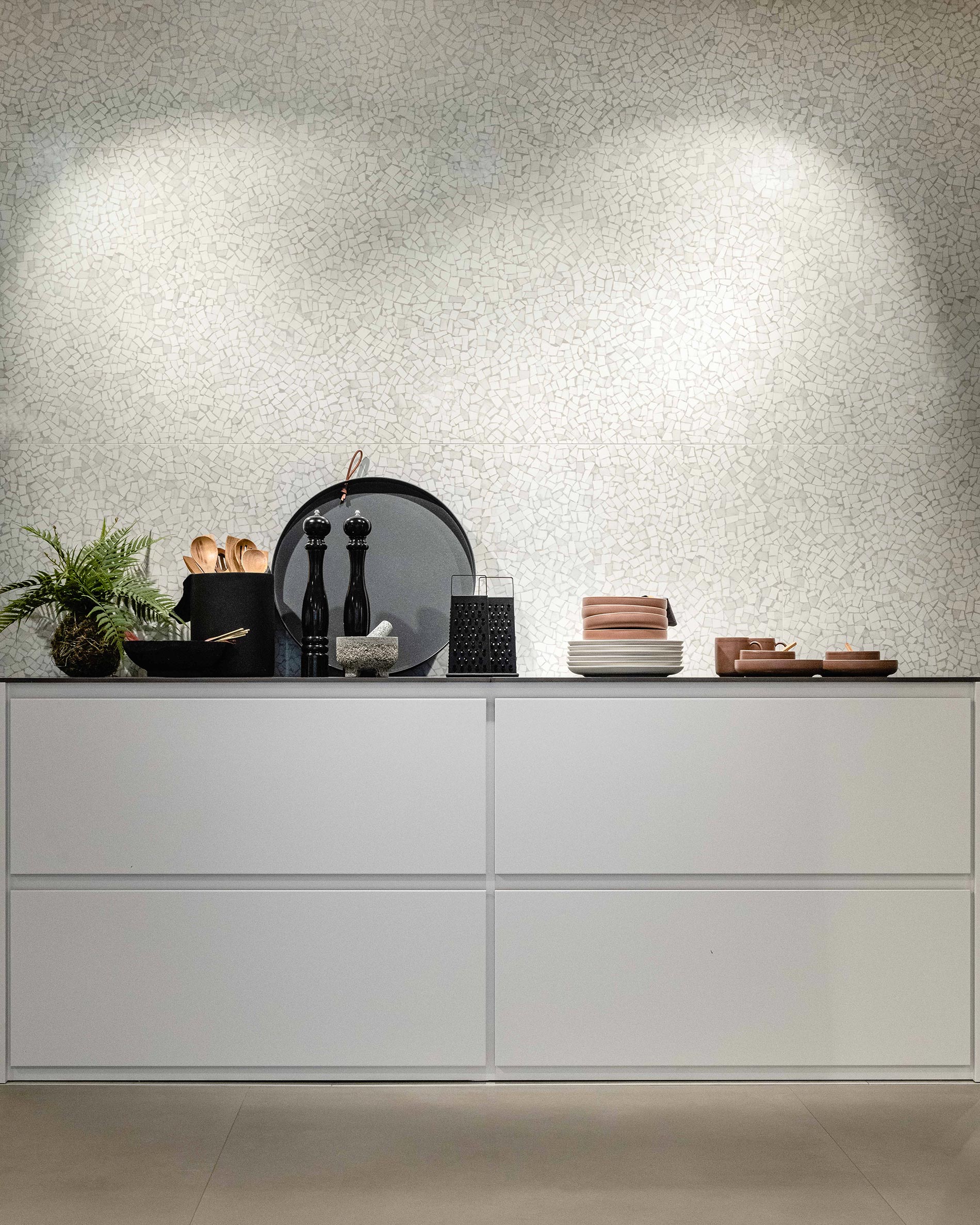
Neutrals are nothing but muted colors, with a minimum amount of color where white or grey prevails. They are light nuances that recall nature, such as sand, beige, cream, grey, but also white and brown.
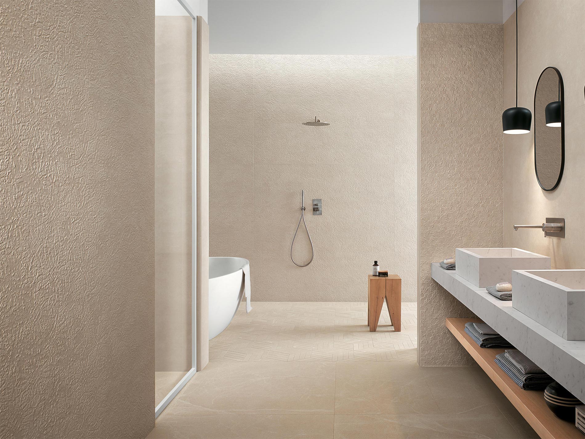
For a house with a natural soul we must start from a neutral base, and there is nothing better than starting from surfaces. Floors and walls in neutral tones, but also and above all with palpable textures that recall natural and tactile materials such as wood and stone.
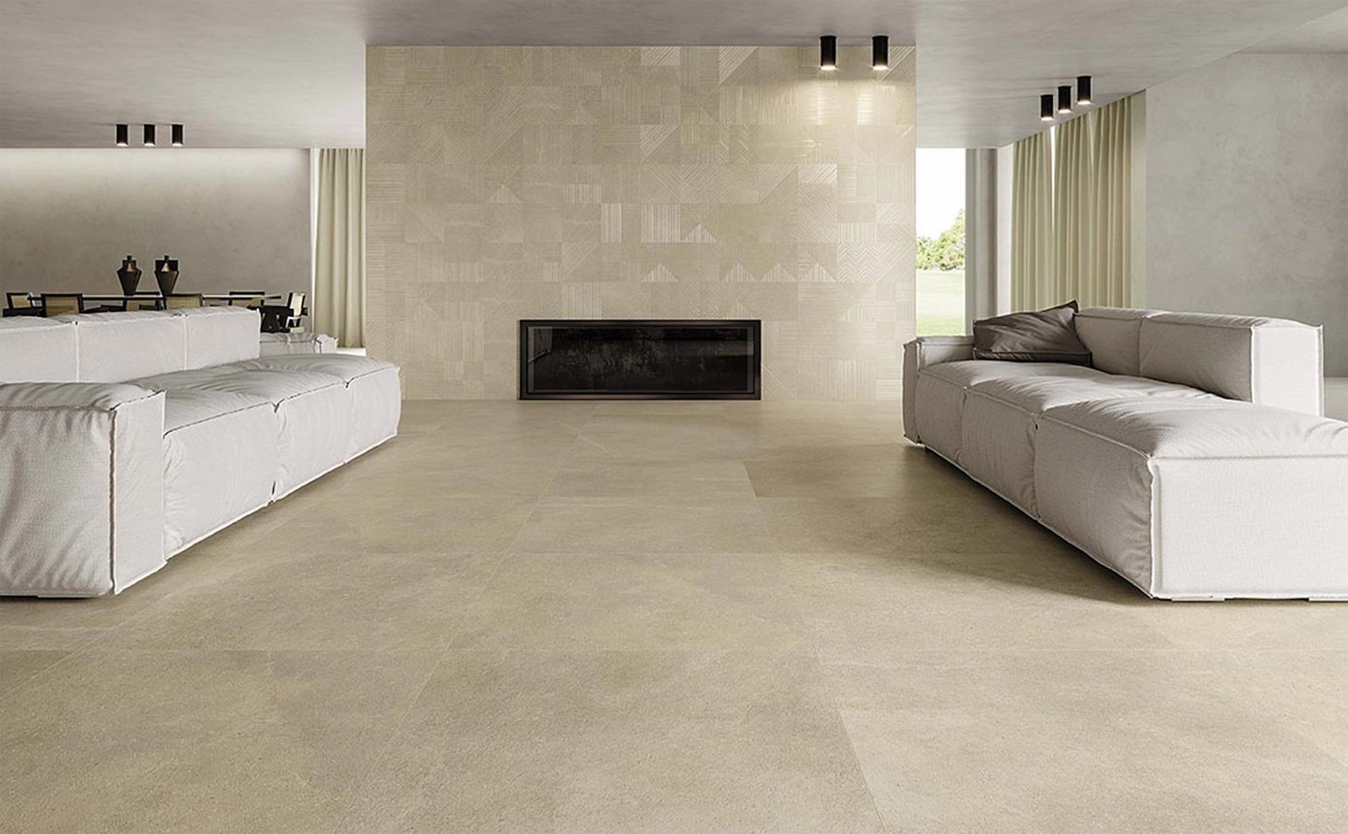
Wood and stone effect porcelain stoneware floors
A house of natural inspiration, with neutral and soft colors needs references to material and rough materials. It goes without saying that the surface with which we will be most in contact in our wanderings around the house will be the floor.
It is enough to look at some images of houses with sandy shades to understand that on the ground, but not only, a reference to the stone or wood effect is fundamental. Wood because for everyone is synonymous with contact with nature, thanks to its warm and dynamic texture.
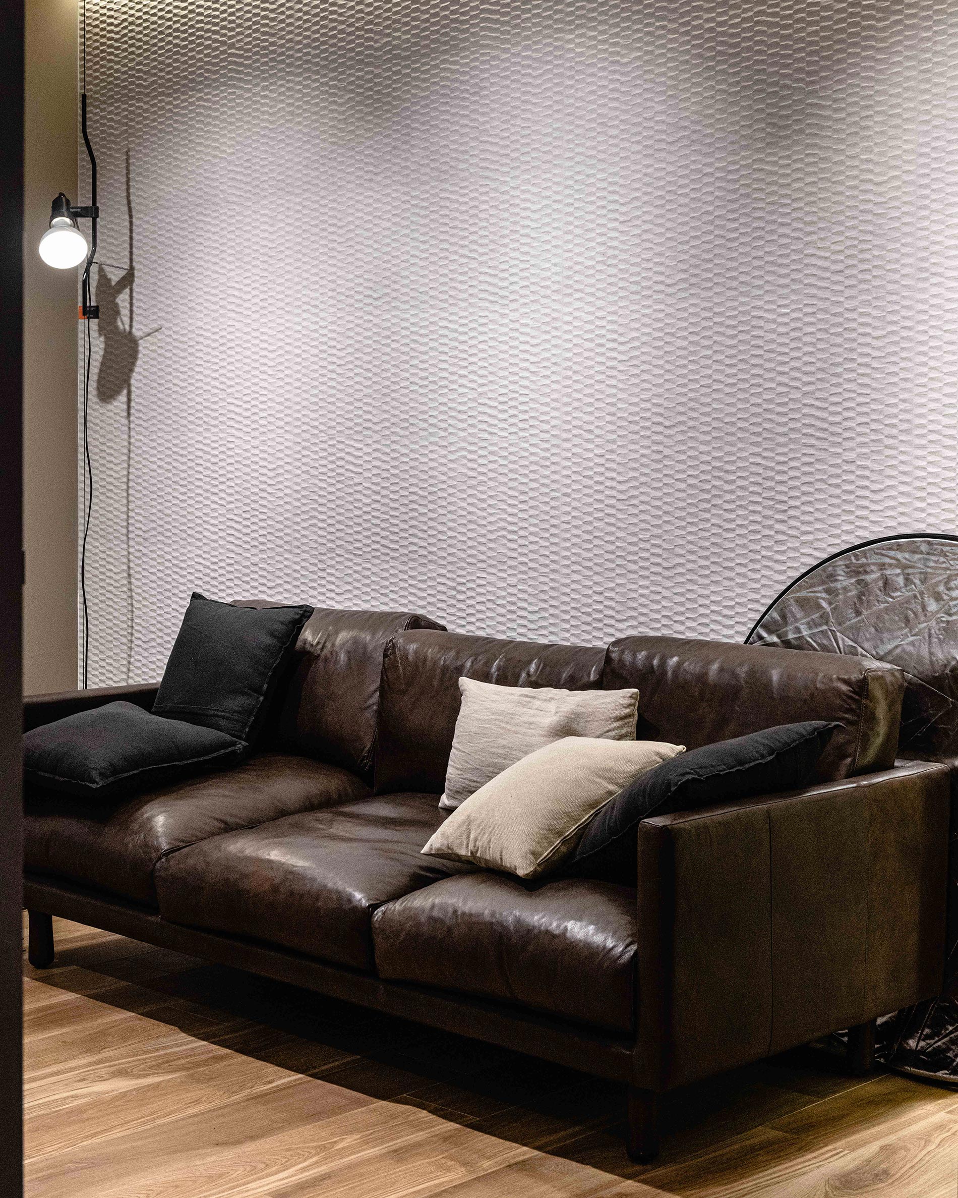
The stone, however, must be chosen with care. For a natural style house, I recommend a rough and slightly veined effect, like that of the Maku collection by Fap, or a homogeneous and velvety effect like that of the Nux collection.
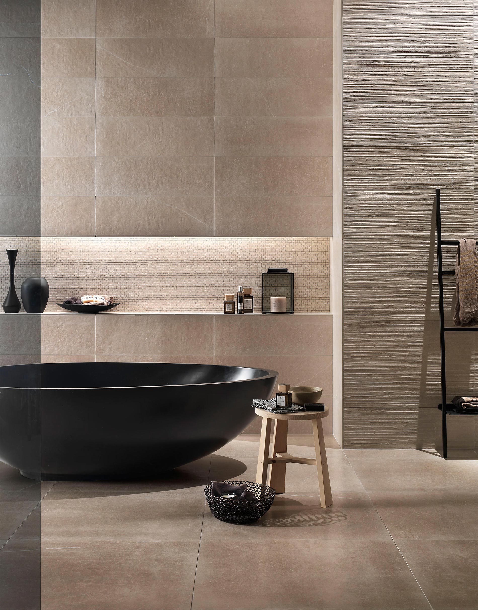
I do not exclude even a concrete effect tile, in large format if the idea is to make the floor a completely homogeneous and continuous surface, like a large carpet that runs all over the room. The environment will tend less to the natural rustic style and will approach the modern minimal. In any case, it is important to be incredibly careful to choose the right nuances.
For a natural style house, I recommend sand tones, beige, and possibly terracotta, and I would say to avoid grey.
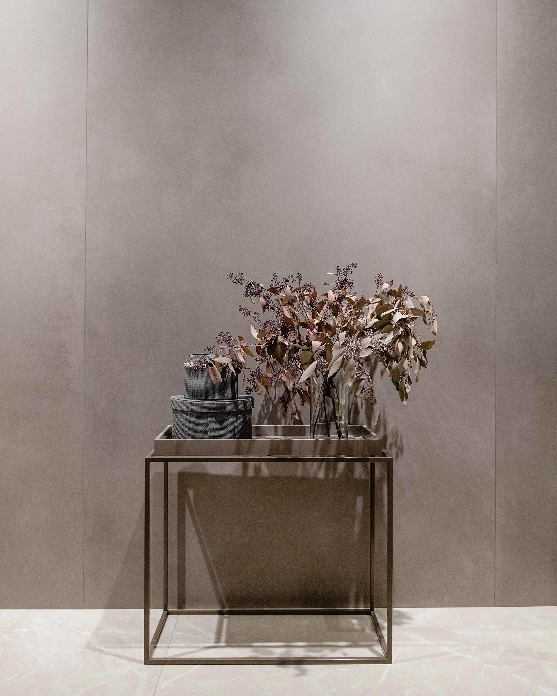
Neutral walls and three-dimensional textures
When designing a house with nature as inspiration, it is important not to underestimate the effect of the walls. It is necessary, both regarding the furnishings and the walls, to avoid the flat and monotonous effect, focusing on the three-dimensionality of the surfaces. If the colors are neutral and delicate, the furnishings and surfaces must bring movement, roughness and even a bit of grit, to make the environment pleasant to explore and discover.
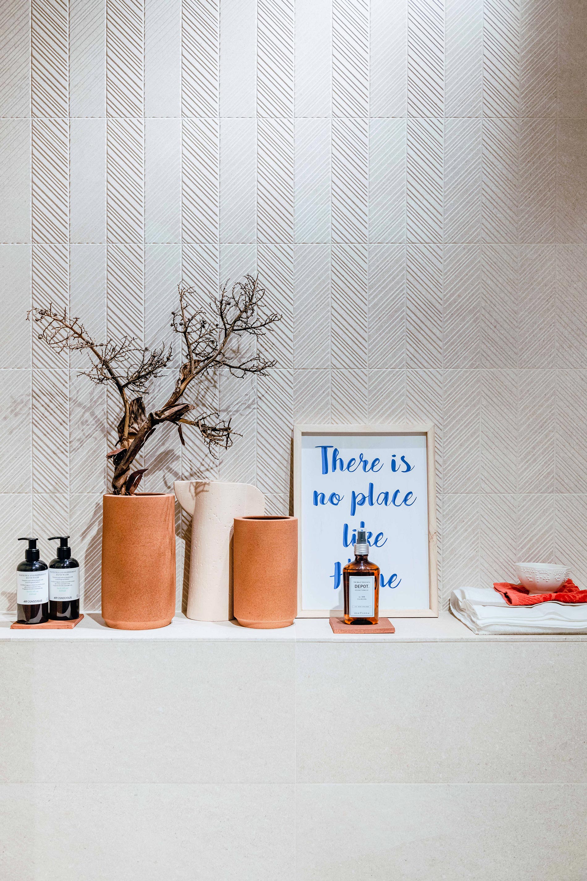
In the field of natural but highly material surfaces, FAP Ceramiche certainly has a targeted proposal. Some of its collections move on natural nuances while playing with textures and textures that give movement and character to each surface.
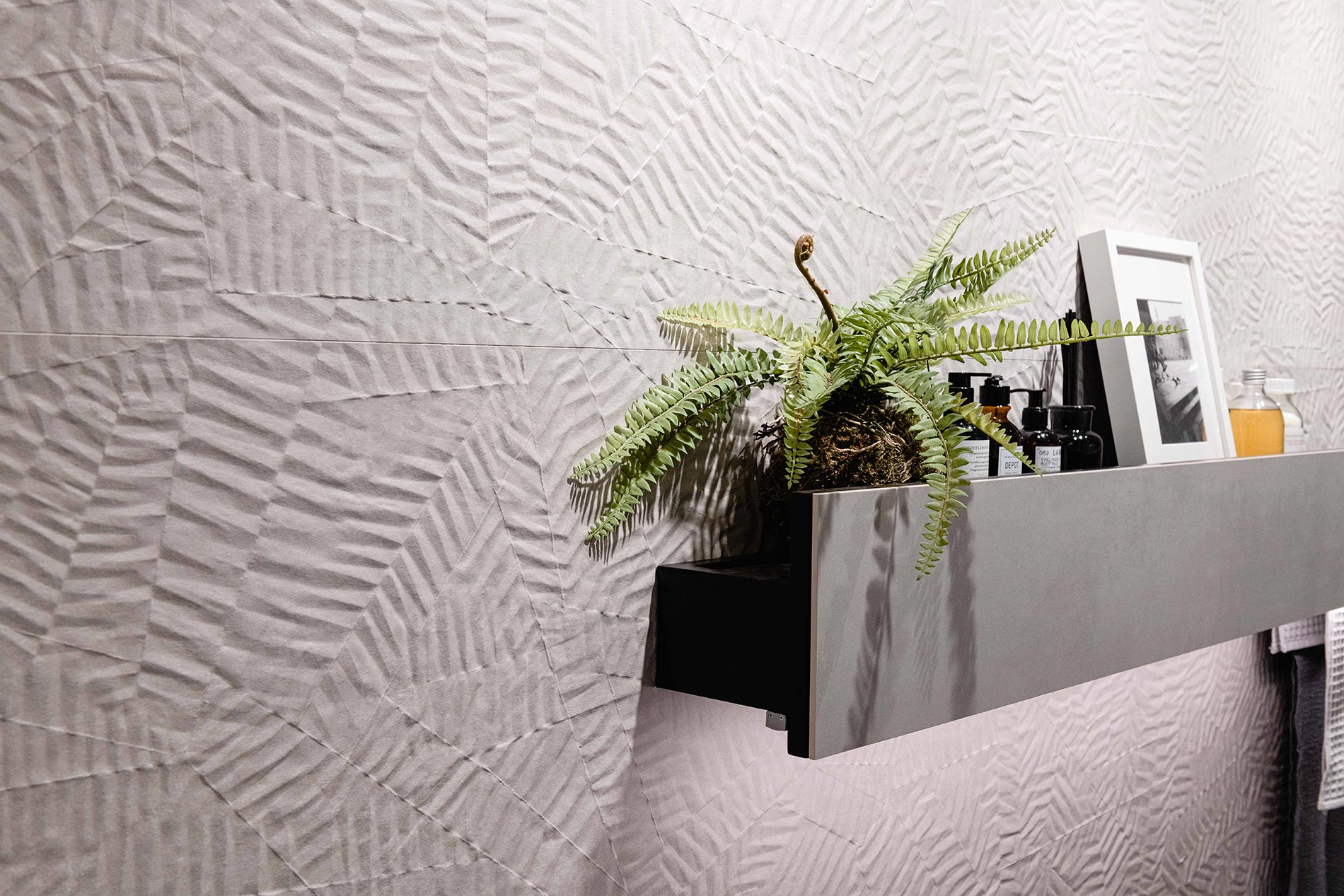
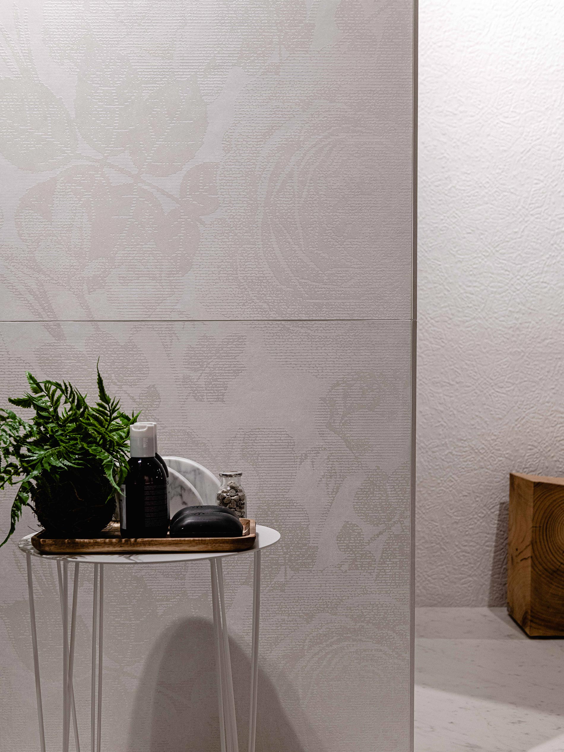
An example, for upholstery, is FAP’s Bloom collection. Large format white-body slabs, where the joints are reduced to a minimum and the 3D graphics help to make the walls homogeneous and give materiality to the surfaces. The Star line is reminiscent of rippled paper and even in pure white the three-dimensionality of the design creates a play of light and shadow that invites you to touch it.
Speaking of cladding slabs, read this post dedicated to WHITE PASTE CERAMICS
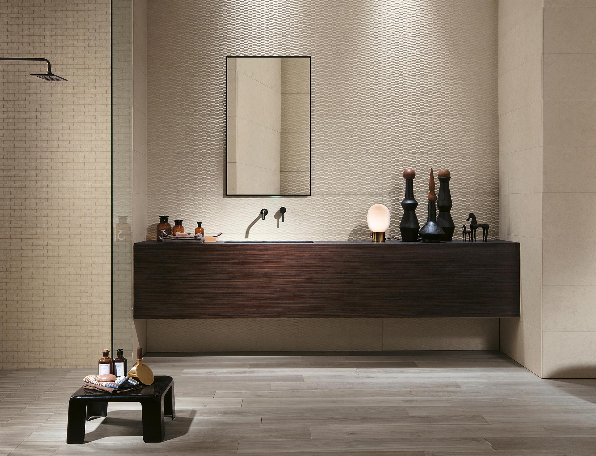
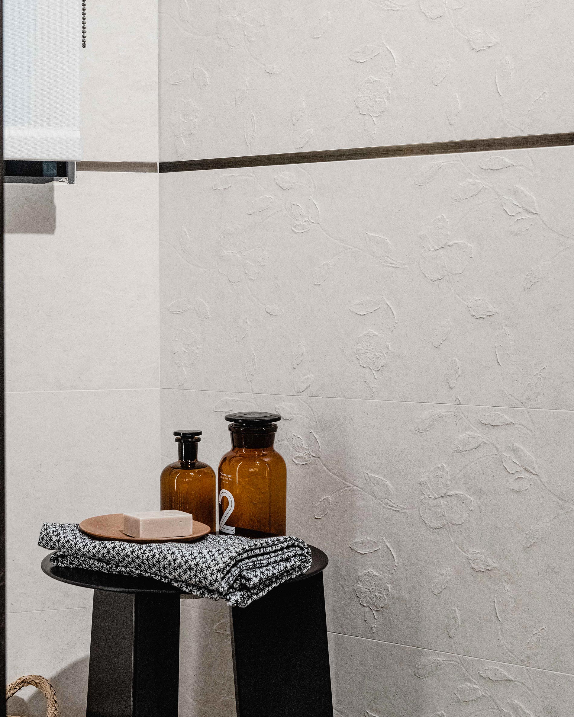
For a three-dimensional and graphic stone effect, also the Lumina Stone collection is the perfect compromise between neutral and three-dimensional: among the color proposals there are white/ivory, beige, and light grey. The three-dimensional graphics provide body to the surfaces, from the more geometric ones like Peak and Edge, to the scratchy ones of Rock or the more romantic ones of Flower. Matte effect and natural colors in neutral and caressing nuances.
Glossy and matte finishes to create movement
However, three-dimensionality is not the only alternative to liven up a room with natural colors. An excellent solution is the alternation between glossy and matte: a variation to the sight and touch.
The neutral color thus acquires movement, the glossy finish, alternating with the matte one, generates a sense of depth that to the touch turns into a dynamic exchange between rough and smooth.
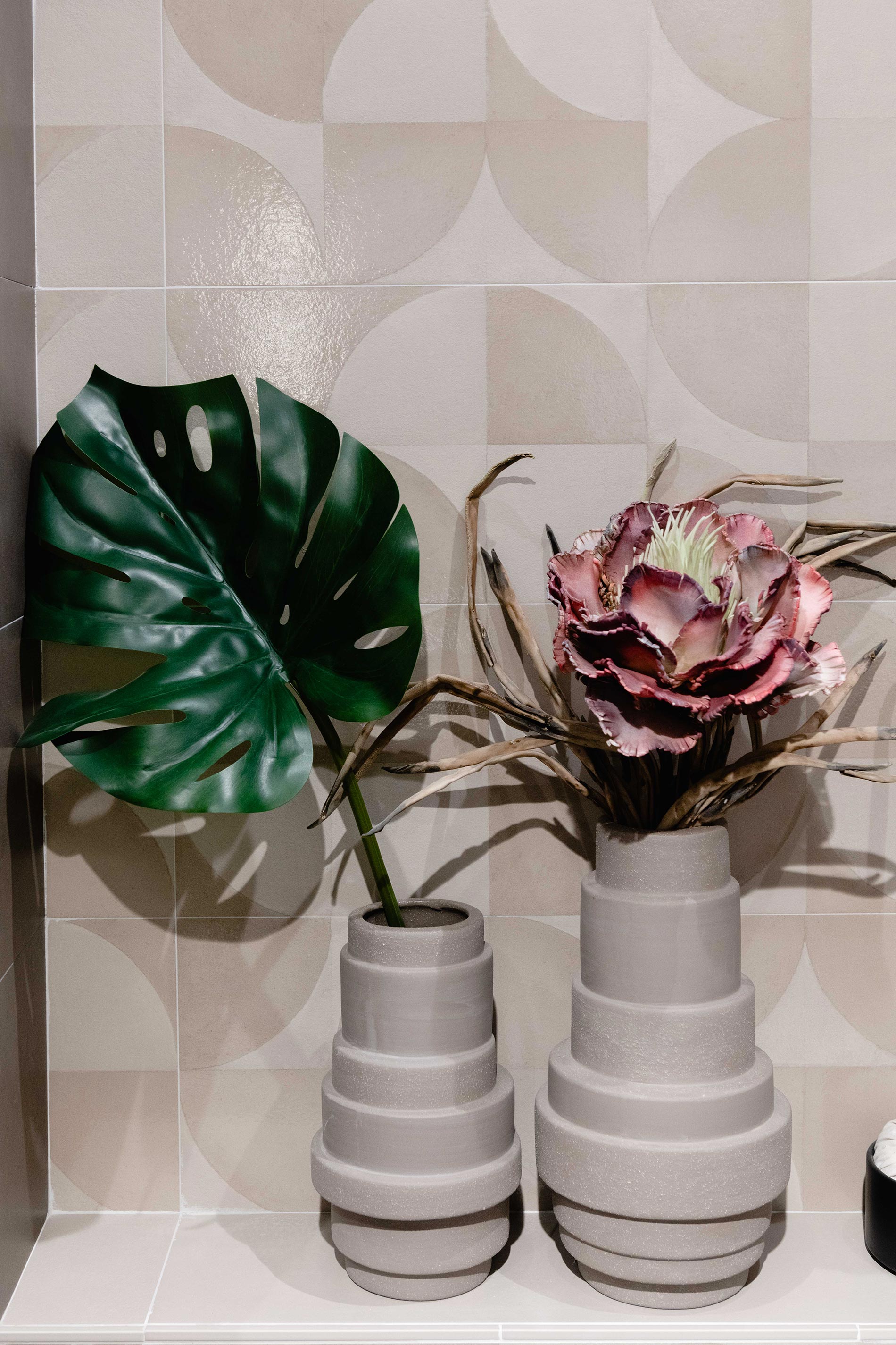
This is a bit like the effect you get when you enter a bathroom with the Deco or Domino tiles from the Mat&More collection. Only neutral and natural colors such as white, beige, taupe and a hint of freshness with azure.
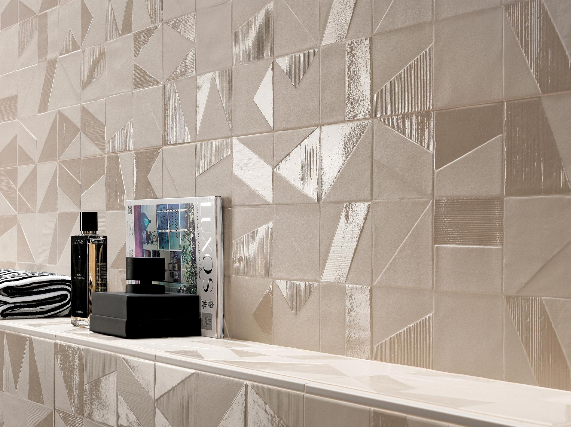
Consider that, in an interior, beige and ivory are the other side of white. Aim for sand or nude if you want a sophisticated and romantic home but remember to dampen their softness with rough and textured surfaces. Do not be afraid to exaggerate in shapes and materials.
Choose beige for an elegant but casual ambience, or taupe for a warm and silky home, but do not forget white.
So, what do you think? Do you want to go crazy for a house in natural style?
If you need help, write me and take a look at my PORTFOLIO!
— This article has written in collaboration with FAP ceramiche. As always, all the opinions are mine. Hope you will be happy to sustain the brands that supports this blog! —

Leave A Comment