This post is also available in ITALIANO
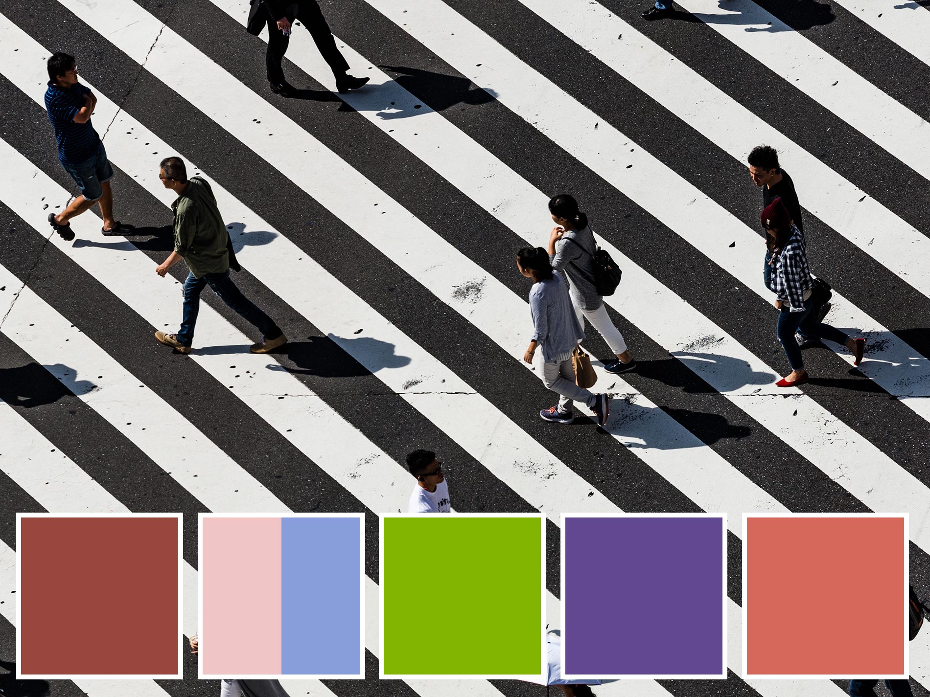
Every year Pantone selects the colour of the year: The first weeks after the announcement are the net-war, where everyone posts something about the new colour, a competition for the best and fastest.
“Greenery fits everything!” – “Ultraviolet is perfect both for blondes and brunettes!” – “Rose quartz fits in the bathroom, whereas in the kitchen it’s better not!” – “living coral sucks”
And so on and so forth.
As usual, I’m late, just to confirm that being an influencer is not my job.
I need time to look, understand, internalize information, that’s why I wrote my post dedicated to Ultraviolet four month later, talking more about stars and planets than the colour. And I don’t know yet when I’ll write the one about living coral.
he reason why I’m writing today’s article.
Just a question: Are we really sure that Pantone Color Institute wants to suggest what to wear or how to furnish our houses?
I don’t think so.
I’m more convinced that Pantone shows the way the world is going on, or how it should go, year after year.
That’s what I’ve noticed for the last five years, namely the period where I start working with design and communication.
Let’s going on step by step
2015 | Marsala

2015 started with Marsala. A warm and embracing colour, inspired to the earth and the natural products.
Marsala means the explosion of the taste buds when drinking wine.
Marsala is pleasure, edonism.
Marsala is enjoying life, living here and now.
2016 | Serenity e Rose Quartz

A year later, we must speak about rights and equality.
So, for the first time Pantone suggests TWO colours of the year.
Serenity and Rose Quartz are a message: We can be more than one, we can decide who we want to be.
Each of us can decide for himself, if being serenity or rose quartz or even both.
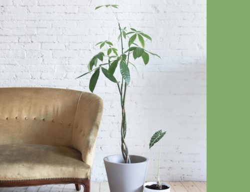
2017 | Greenery

In 2016 Leonardo di Caprio won the Oscar prize and talked about global warming. A year later, Pantone chose Greenery, and reminded us of how important we are to the nature and viceversa.
And we started bringing plants in and out our house, we started talking about comfort, living in touch with nature, and taking care of our garden, but not only.
2018 | Ultraviolet

As important as taking care of our planet is looking beyond. So, Pantone Color Institute suggests Ultraviolet, a colour bringing out of the reality borders, to a wider imaginery, to the stars.
Like Frida Kahlo, whose image, between 2017 and 2018, has been badly exploited.
2019 | Living Coral

Finally, here’s the new year: what’s the most hot social theme?
Does nothing come to your mind? I help you: did you read about the plastic isle in the Pacific ocean?
Well, water is the theme we spoke the most this year.
>>> I’ve already written about water.
That’s how Pantone decided to bring our attention on this theme: it didn’t seem trivial with a boring petrol blue, but chose the colour of the marine endangered species, coral.
So, Pantone Color Institute doesn’t care about how it fits with our complexion.
It says something about our society and makes us reflect on very important theme, starting from the simplest question: What’s your favourite colour?
Leave A Comment