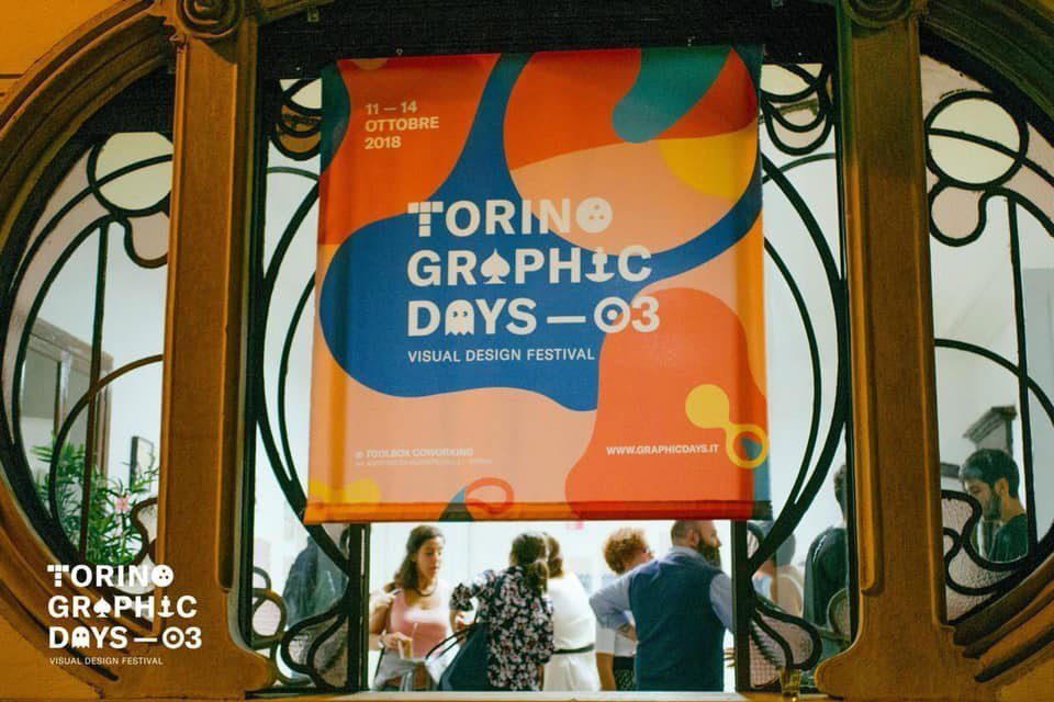
This post is also available in ITALIANO
Call me Ishmael. Some years ago- never mind how long precisely- having little or no money in my purse, and nothing particular to interest me on shore, I thought I would sail about a little and see the watery part of the world.
This is how Herman Melville’s Moby Dick starts. It is probably the most important novel about travelling and the artists participating to the exhibition took inspiration from it.
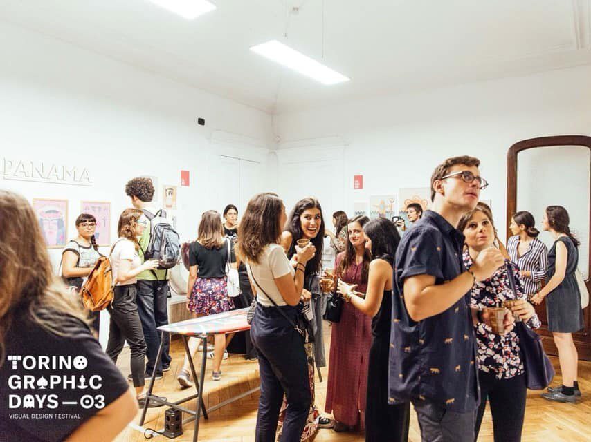
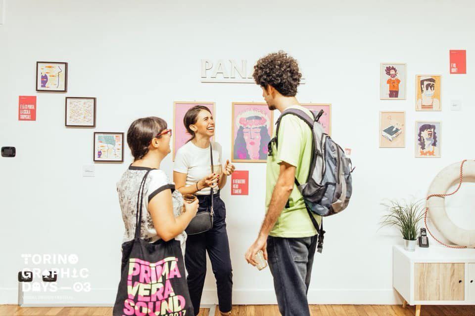
In the occasion of Torino Graphic Days, Panama Design studio settled in via Passalacqua turned into a ship. The stately liberty window became a big porthole; the winding staircase looked like a passage to reach the boat deck. And the deck looked out to the sea, from a small railing. And then the white walls who hosted the illustrations of the Panama Design crew.
The surf board in the middle of the place is Mastereaster’s, or rather Patrizia Matrapasqua, surrounded by the works of six other artists. Every illustrator had been given out a title concerning their works and each of them was palindrome! Like sailing in the sea, with no sense. Drifts, boardings, escapes and comebacks.
>>> I’ve already written about it here: festival preview.
Illustrations and palindromes
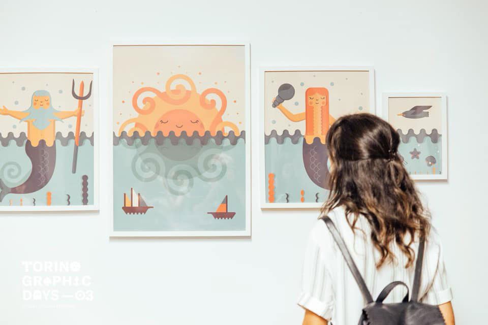
A essi do l’Odissea. Or rather Gabriele Pino, with his sirenes, his personified winds and a little of good mytology. Gabriele still surprises me for his capability of researching and tapping into an antique cultural heritage. The one of myth, of the popular wisdom and of the legends. I would say, Gabriele’s one is an intellectual research, turning then in drawing, universally comprehensible.
Isole per re pelosi, the ones of Roberto Gentili. They are four really different works as far as techniques are concerned, but all about sea monsters as protagonists.
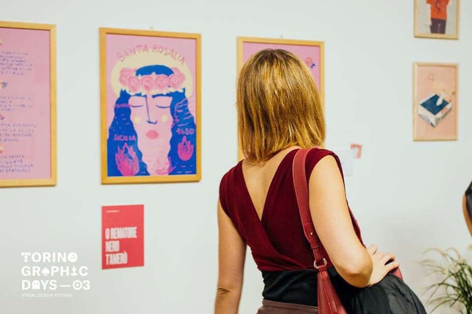
O rematore nero, t’amerò. The title given out to Clorophilla is about the story of Santa Rosalia and her journey from Sicily to Liguria. Clorophilla (or Ludovica Basso) loves to work on traditional stories and icons, through a great variety of techniques. To her, illustration is not only drawing, but also collage, painting on ceramic, embroidery and needlework.
Together with them, also Elisa Baldissera, Federica Ubaldo and Chiara Morra exhibited at Panama Design studio.
Sirene Journal
These are the occasion where to discover new projects! Besides the beautiful illustrations, I found Sirene Journal. While strolling around, I came across a magazine with greyish pages, open in the middle. I’ve been attired by the title “The liquid shape of summer”, written in an elegant font. Sirene Journal is about Surfing, freediving, stretches of ocean in the words of a solo sailor, islands, reportings related to pollution and protection of marine life. Unlike other media dealing with sea sports and activities, Sirenes’s approach is never technical but always emotional.
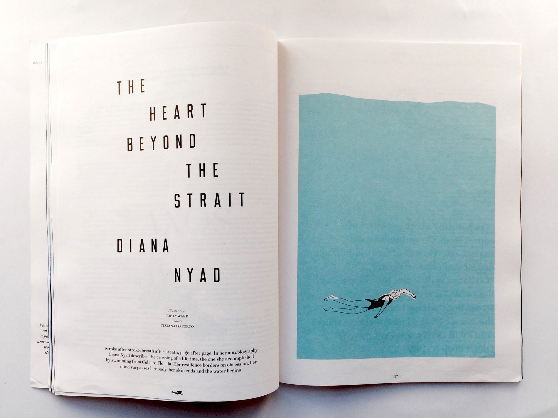
via joelyward.co.uk.
Leave A Comment